Are you considering an update for your kitchen? Perhaps you are fed up with the colours that are in it at the moment and you want a change.
Do you love the colour green and think it would be perfect for the heart of your home? But what shade or shades of green do you choose? There is such an array of green tones, which include lime, forest, leafy, clover, mint, pine and olive. It's a colour that's associated with freshness and nature and it’s virtually guaranteed to revitalise and reinvigorate your kitchen.
Green is a fantastic colour choice for your kitchen. However, make sure you get it right!
It’s important to know what mood and feel you are trying to generate
Bright leafy greens can create a contemporary feel while paler shades such as celery will be more subtle. If you are looking for a warm feel to your kitchen, try a rich shade of green-grey on the walls while a mint hue will give your kitchen a bright and airy feel.
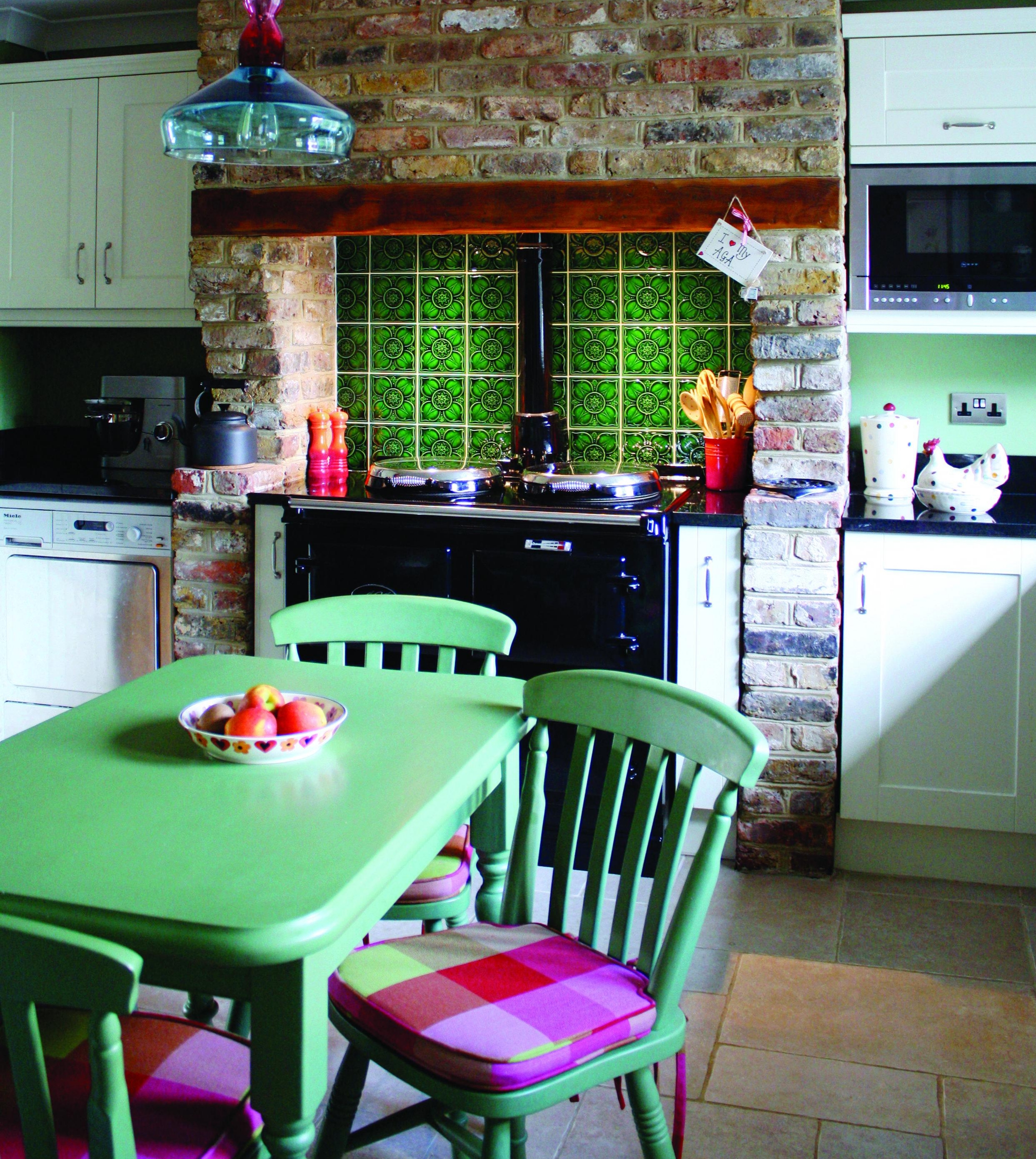
The decision can be a tricky and one of my tips is to take inspiration from the shades of green that are all around you and can be found in the kitchen as well. Think of a crisp green eating apple, a lime, a cauliflower floret, a slice of cucumber or a fragrant herb such as basil or sage. This is one of the reasons why green is such a fantastic kitchen colour choice as it blends in beautifully with the fruits, herbs and vegetables of your culinary creations.

2017 Colour Trends
Every year, Pantone has a "Colour of the Year" and this year they have selected "Greenery", a neutral shade which they describe as, "A fresh and zesty yellow-green that evokes the first days of spring when nature’s greens revive, restore and renew." This is a colour that will generate lots of ideas and themes.
Farrow and Ball have listed one of their colour trends for the year as “Studio Green" which is a lovely dark moody green, which is bound to be very popular in the kitchen. The company describes it as “unapologetically clubby with a fantastically timeless old world quality”. Walls in this colour will not only create an alluring retreat, but also provide a sanctuary.
Dark or sludgy green is a colour tipped by many to be big in 2017 and lush botanical greens are expected to continue to grow in popularity.
Characteristics Of Green Tone
• Complement warm tones
• Conjure up the past
• Contrast with copper and brass
• Fabulous for splashbacks or cooking spaces
• Enhance features when used as a bold colour
• Add the “wow factor” with a feature wall
• Combine with contemporary textiles and fabrics
• Can be used in any size of kitchen
Green goes well with earthy tones, which really bring out its warm side and it’s a super colour for your cupboards and cabinets. Why not paint window and door frames in your selected tone? There are also some amazing tiles for floors, splashbacks and wall coverings, which are all one colour of green or feature shades in them.
British Racing Green
One shade that will really have you reminiscing about a bygone era is British Racing Green (BRG). Let your mind run wild as you conjure up images of Jaguars and Aston Martins at Le Mans or Brooklands. Although there is still some debate as to an exact hue for BRG, the term is currently used to denote a spectrum of deep, rich greens.
Contrast With Copper And Brass
Dark green also contrasts beautifully with copper and brass which both have had a huge resurgence as materials for interiors, particularly for kitchen tap fittings and finishes on cabinets and cupboards, furniture frames and lighting.


Don’t overlook the finishing details
Use abstract prints or advertising posters in complementary colours to enhance your designs. There are also some amazing fabrics and textiles and James Hare has a new collection of silks available in various shades of green.
Are you looking for a vibrant and individual working kitchen that reflects your character? Here at Nicky Percival Interiors, we pride ourselves on our service, which is always personal and inspirational. Please get in touch on 07773 372158 or email nicky@nickypercival.co.uk for a without obligation chat.